Turning an optician's instinct into a product
Reframe · A self-initiated Product Office study · 2026
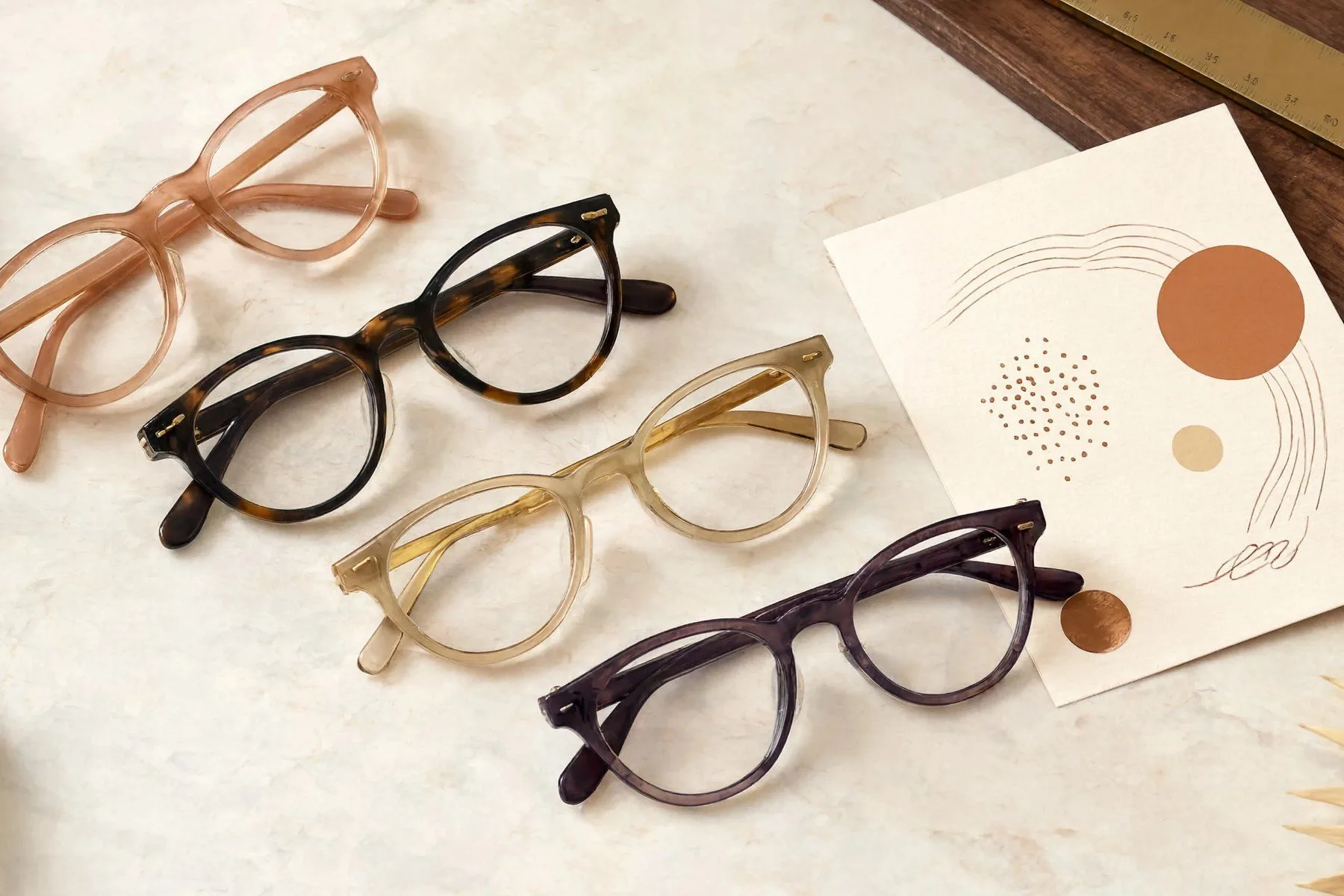
The outcome first: confident on paper, corrected by a real face
What I owned: The whole thing, end to end. I chose the problem, wrote the scoring logic, stress-tested it against real evidence, sized the market, and designed and shipped the in-store product front end myself.
I built a recommendation engine that scores any eyewear frame against a face on seven weighted criteria, each with an explainable reason instead of a black-box guess. The scoring rests on established styling logic: how colour, shape and size play against a face. On studio product shots it looked right. Against real on-face photos, about a third of the rankings didn't hold, because a real face carries variables a rulebook flattens. That gap, model versus reality, is now the product's engine, and it is built to keep closing it.
The problem I chose to solve: the hardest thing to scale
Independent opticians survive on expertise, and expertise is expensive. A senior optician reads a face in seconds, colouring, shape, proportion, and narrows a whole wall of frames to the few that will work. A junior can't do that yet, and when the senior leaves, the instinct leaves too. Customers left to browse try on a dozen frames, tire of deciding, and walk. Conversion sits around 35 to 45 percent.
Online players compress margins from one side, staffing costs squeeze from the other. That gap, a scarce expert eye that cannot be cloned, is the product.
The work: making judgment falsifiable
Most "AI stylist" tools either visualise (here is what the frame looks like) or output a black-box pick. I went the other way and made the reasoning the product.
I broke "what suits a face" into seven weighted criteria. Then I wrote the compromise maths: exactly how much a mismatch costs, and where two mismatches compound. A frame scores 9.5 because warm tortoise hits best on colour and shape and misses only metal at the bridge. Every score traces to a rule. Anything that cannot (taste, era, vibe) is explicitly out of scope, so it cannot quietly move a number.
That discipline is what makes the system trainable and defensible. A rule you can state is a rule you can prove wrong.
The product, live: the scored shortlist made usable
The screens below are the real, clickable prototype. Scroll them, open the filters, read the reasons behind each score. The capture and analysis are mocked with real project data, so the product is shown, not faked. This is the surface the optician runs in front of a client.
LIVE PROTOTYPEEach frame comes from the store's own inventory, scored and explained, with a live stock signal (in stock, low stock, order in) and an optician override the system learns from. During the fitting the optician taps each frame loved, refused, or didn't survive once worn; loved frames turn green and cap at six, ready to build the client's report.
Two more screens sit either side of the shortlist. The face profile shows the seven detected reads, each one tappable so the optician can confirm or override with a single reset-to-detected safety net. The client report is the take-home: a branded one-page shortlist the client leaves with, a conversion lever and a marketing surface in one.
LIVE PROTOTYPEThe seven reads, explainable and reversible. Tap any read to change it; the edit is obvious, does something, and can be undone.
LIVE PROTOTYPEThe take-home report always shows a focused six: the frames the client loved come first, marked, then the next best matches round it out, so it feels complete without overwhelming. It carries the reason each frame suits rather than a score, and every report is branded, a marketing surface for the store.
The number that changed the product: evidence overturned a third of my rankings
I scored frames from studio product shots, then checked each against photos of the same frames worn on a real face. About a third of the rankings didn't survive the move from paper to a person.
On studio shots, bold high-contrast frames scored near the top on colour and shape. On a real face, several dropped hard. The variable I had underweighted was visual weight: how much a frame's mass and contrast assert themselves against a person's features. Bold frames are not wrong, strong features carry them, but a product shot can't show that interaction and a real face can. So the model doesn't hardcode a verdict; it reads visual weight per person and keeps learning.
No frame suits everyone. The bold frame a soft face can't carry is exactly right on a strong one, and the light frame flips the other way. So the engine scores visual weight against each individual face, not a fixed ideal, which is also why one test on one face was only the start of the loop.
From methodology to product: framing the logic as a business
With the logic validated, I framed it as a product: a tablet app the optician runs in-store. A 30-second guided photo capture, a scored shortlist drawn from the store's own inventory (not a universal catalogue), an override the system learns from, and a branded one-page report the client takes home. A nervous walk-in can even take the tablet and explore the shortlist themselves while the optician serves someone else.
~28,000 independent opticians across my target European markets.
~50M EUR ARR serviceable market.
560 to 1,400 stores as a realistic three-year target.
These are hypotheses to test with optician interviews, not booked revenue.
I also designed and shipped the front end myself, the editorial brand, the tier system, the interactive card layout, so the concept could be shown and used, not just described.
Product decisions: small calls, each one deliberate
The flow is used by an optician but read by a client, so the tone shifts mid-flow: working language for the professional (reads, scores, stock, overrides), warm plain language for the client (the welcome and the report). One product, two voices, switched on purpose. A few of the calls behind the prototype:
Guide the choice, don't just offer it
The criteria screen leads with one recommended path (read the face automatically) and a quiet secondary option for control. A default that is easy to accept and easy to override, not two equal options that make people hesitate.
Turn the fitting into signal
As frames go on and off, the optician taps each one loved, refused, or didn't suit once worn. One familiar gesture captures what actually happened in the fitting, feeds the client's report, and trains the model. Three tags, a lot of depth, no extra work.
Cap the report at six
Customers who try 5 to 12 frames hit decision fatigue and walk. The take-home report stops at six on purpose: enough to show range across colour and shape, few enough to actually decide from. Fewer, well-explained options convert better than a longer list.
Outcomes: what it delivered
Of my first rankings overturned once tested against a real face, then recalibrated mid-process.
A weighted, explainable model where every pick traces to a stated rule, and out-of-scope factors can't move a number.
Serviceable market I sized from the ground up, with a segmented three-year go-to-market thesis to test.
Problem, logic, brand, and a clickable in-store product, researched and shipped end to end.
What I'd take from this: designing for the correction
My starting instinct was mostly right; the third it got wrong is the part that mattered. The useful move wasn't having the better eye, it was building a system that expects to be corrected, by a real face, by the optician, by the store's own results, and gets better each time it is. That is what turns a point of view into a product.